These CSS Techniques Are Outdated
A practical guide to modern CSS replacements for outdated techniques, covering centering with grid, the :has() selector, system-ui fonts, logical properties, and the inset shorthand.
Centering an Element with transform: translate(-50%, -50%)
Previously, developers used transform: translate(-50%, -50%) together with top and left properties for centering. The modern approach replaces this with display: grid and place-items: center, simplifying the code and eliminating the need for position: relative.
Old way:
.parent {
  position: relative;
}
.parent::before {
  position: absolute;
  top: 50%;
  left: 50%;
  transform: translate(-50%, -50%);
}
New way:
.parent {
  display: grid;
  place-items: center;
}
Styling Elements Based on + or ~ Selectors
The conditional "adjacent sibling" selector easily broke when the order in markup changed. The :has() pseudo-class provides a more robust solution, ignoring element placement.
Before:
.field__input:valid + .field__hint {
  display: none;
}
After:
.field:has(.field__input:valid) .field__hint {
  display: none;
}
Declaring a System Font Stack
Instead of long font lists (the "System Font Stack"), it's sufficient to use font-family: system-ui, which automatically applies the operating system's system font. No more maintaining lengthy fallback chains like -apple-system, BlinkMacSystemFont, "Segoe UI", Roboto, Oxygen-Sans, Ubuntu, Cantarell, "Helvetica Neue", sans-serif — a single keyword does it all.
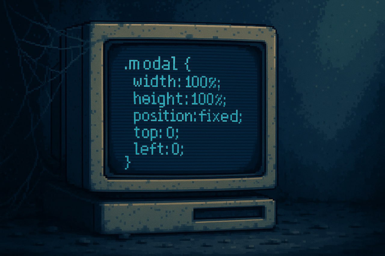
Setting Dimensions with inset
For full-filling elements (modal windows), instead of four separate properties (top: 0; left: 0; width: 100%; height: 100%), you can use inset: 0.
Before:
.modal {
  position: fixed;
  top: 0;
  left: 0;
  width: 100%;
  height: 100%;
}
After:
.modal {
  position: fixed;
  inset: 0;
}
Logical CSS Properties
Instead of margin: 0 auto and padding: 1rem 0 2rem, use logical properties: margin-inline: auto and padding-block: 1rem 2rem. Logical properties respect writing direction, making your CSS automatically work for right-to-left languages without any changes. They replace physical directions (left/right/top/bottom) with logical ones (inline-start/inline-end/block-start/block-end).
Block Element Width
Instead of display: inline-block to make an element shrink to its content width, use width: fit-content. This preserves the element's natural block-level placement while achieving the same sizing behavior. The element stays on its own line and participates in normal flow, unlike inline-block which changes the display context entirely.
Arranging Elements in a Column
For vertical arrangement with gaps, display: grid; gap: 1rem is more efficient than display: flex; flex-direction: column; gap: 1rem. Grid defaults to a single column layout, so you don't need to explicitly set the direction. This saves a property declaration and is arguably more semantically appropriate for simple vertical stacking.
FAQ
What is this article about in one sentence?
This article explains the core idea in practical terms and focuses on what you can apply in real work.
Who is this article for?
It is written for engineers, technical leaders, and curious readers who want a clear, implementation-focused explanation.
What should I read next?
Use the related articles below to continue with closely connected topics and concrete examples.