Unforgivable Icon Design Mistakes in macOS Tahoe
A detailed critique of Apple's icon design decisions in macOS Tahoe, examining how adding icons to every menu item violates fundamental UX principles — from lack of differentiation and cross-app inconsistency to illegibly tiny details and confusing metaphors.
This is a translation of Nikita Prokopov's article about icon design mistakes in macOS Tahoe.
Icons Should Create Differentiation
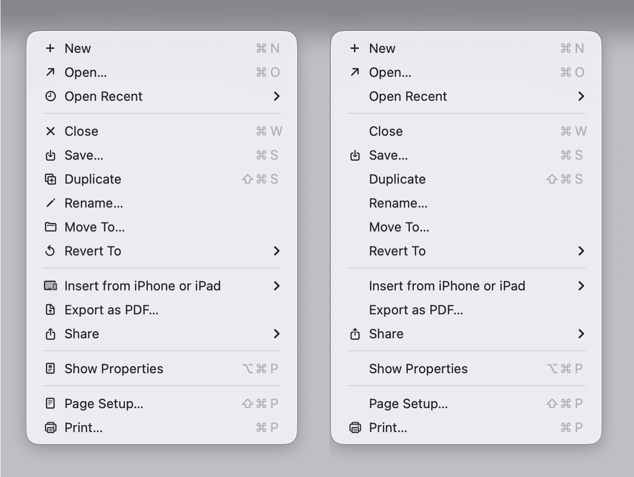
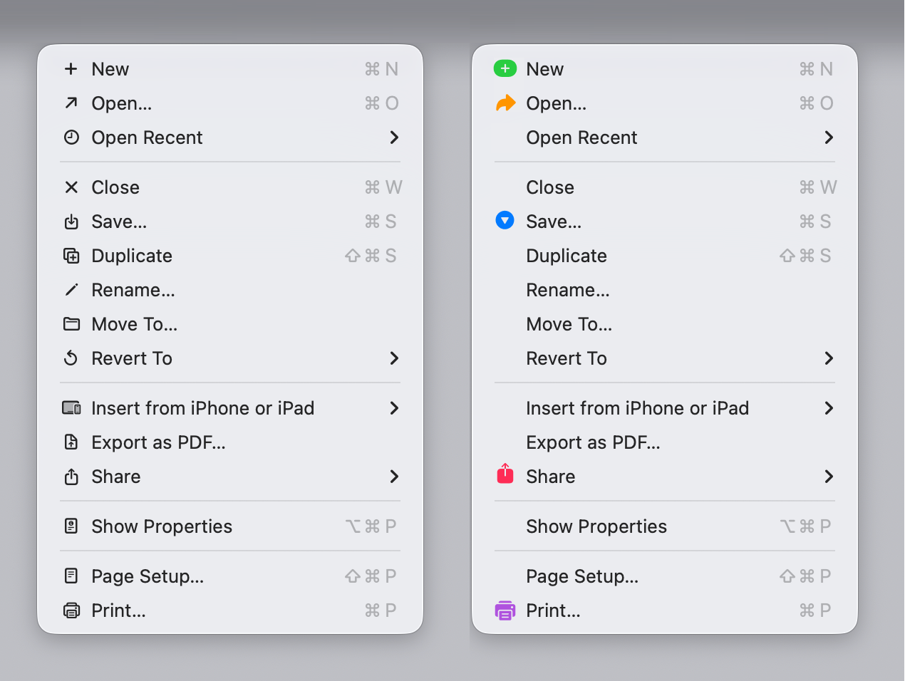
The primary purpose of an icon is to help you find the right item faster. When every single menu item has an icon, nothing stands out anymore. The whole point of a visual marker is that it's selective — it draws your eye to specific items.
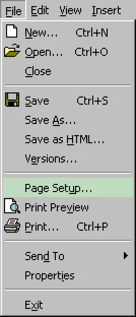
Microsoft understood this better, using icons sparingly and adding color for better recognizability.
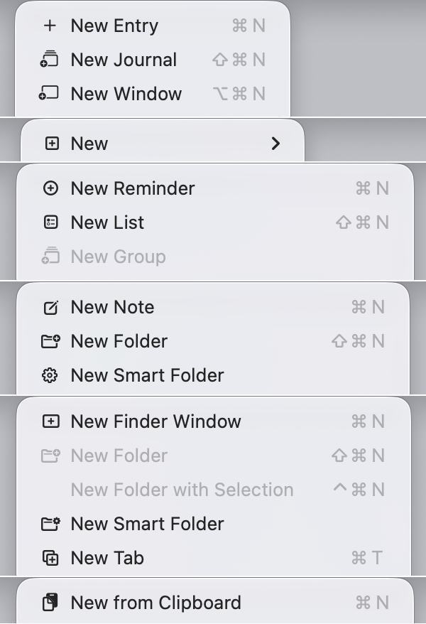
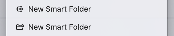
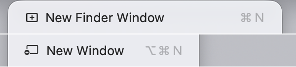
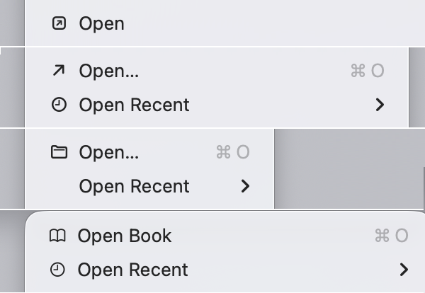
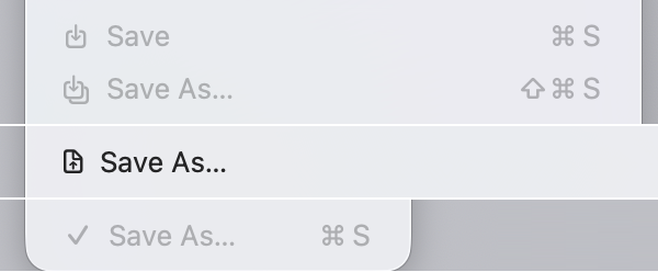
50 Shades of "New"
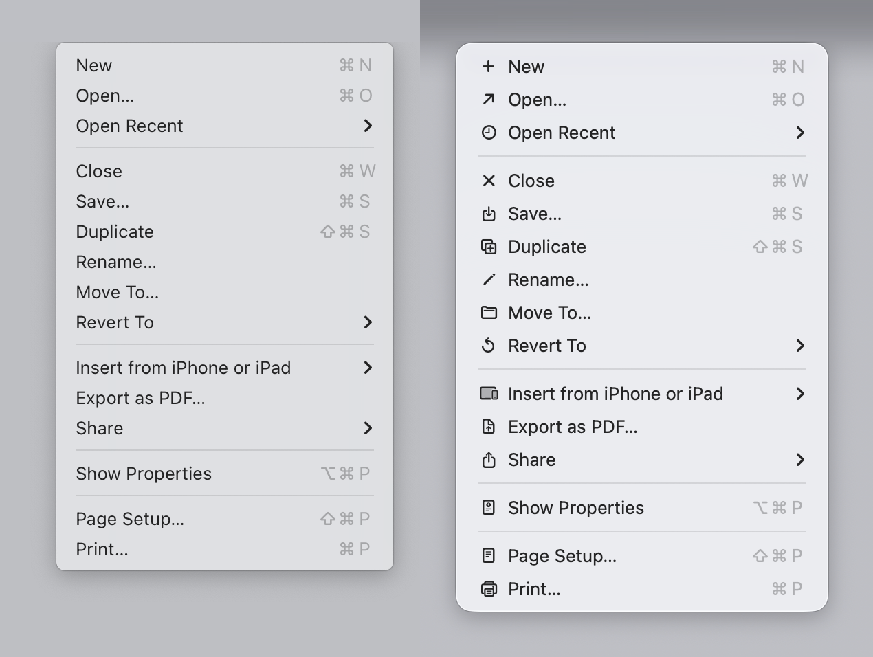
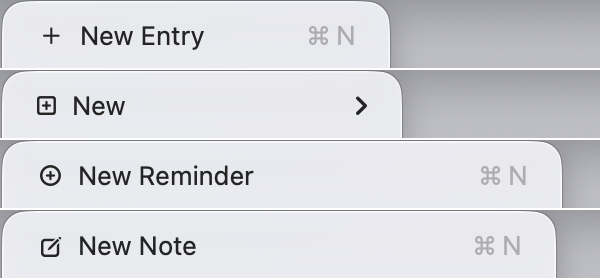
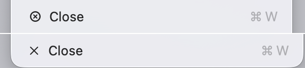
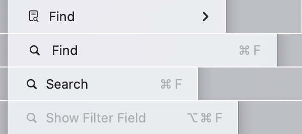
One of the most damning examples of inconsistency: the simple "New" operation is represented by dozens of completely different icons across Apple's own applications. If you look at the icons for New across Finder, Safari, Mail, Notes, TextEdit, and others — they are all different. The same applies to Open, Save, Close, Find, Delete, and other fundamental operations.
This completely defeats the purpose of icons as navigational aids. An icon for "New" should look the same everywhere so that once you learn it, you can find it instantly in any app.
Inconsistency Within Applications
It gets worse: even within a single application, the same operation gets different icons in the menu versus the toolbar. In Preview, Photos, Maps, and other apps, if you compare the menu icon for an action with its toolbar counterpart, they often don't match. This breaks internal consistency.
Duplicated Icons
The same icon is used for completely different actions. The eye symbol means "Quick Look" in one context and "Show Completed" in another. When one visual symbol maps to multiple unrelated functions, it creates confusion rather than clarity.
Excessive Detail at Tiny Sizes
The physical size of these icons is roughly 2.4 mm on modern MacBook Pro screens — actually smaller than the icons in Windows 95, despite having more pixels. Apple crams in microscopic details: a letter "i" made of just 2 pixels, a traffic light in a tiny window icon, half-pixel differences that are supposed to carry meaning but are impossible to distinguish with the naked eye.
The combination of fine detail and tiny physical size is lethal for usability.

Pixel Grid Problems
Using vector-based SF Symbols instead of pixel-optimized bitmap graphics leads to blurriness and subpar rendering. Even at Retina resolution, the icons look mediocre when scaled to such small sizes.
Confusing Metaphors
The symbols chosen often fail to represent their functions intuitively. "Select All" is represented by a text block — why? How does a text field communicate "select everything"? Many icons rely on two-level metaphors that users simply don't decode correctly in the fraction of a second they spend scanning a menu.
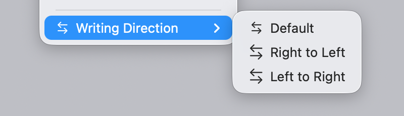
Asymmetric Actions
Opposite operations should use visually related icons. Undo and Redo, Open and Close, Zoom In and Zoom Out — these are pairs, and their icons should reflect that relationship. Instead, macOS Tahoe uses completely unrelated metaphors for paired actions, making it harder to build a mental model of the interface.
Text in Icons
Letters like ABC, Aa, Abc appear as icons for text formatting operations. But they look like text, not icons — creating visual confusion with the actual menu item labels next to them. Is "B" the icon or part of the word?
Hijacking System Elements
Apple reuses arrows and ellipses — symbols that already have established meaning in the macOS interface (submenu indicators, "more options") — as decorative icon elements. This breaks user expectations about what these symbols signal.
Hindering Scanability
The uneven application of icons across menu items — some have icons, some have checkmarks, some have nothing — creates ragged left alignment that makes it harder to quickly scan for the command you need. Before Tahoe, menus had clean, consistent text alignment. Now your eye has to navigate around icons of varying widths, empty spaces, and checkmarks.
Conclusion
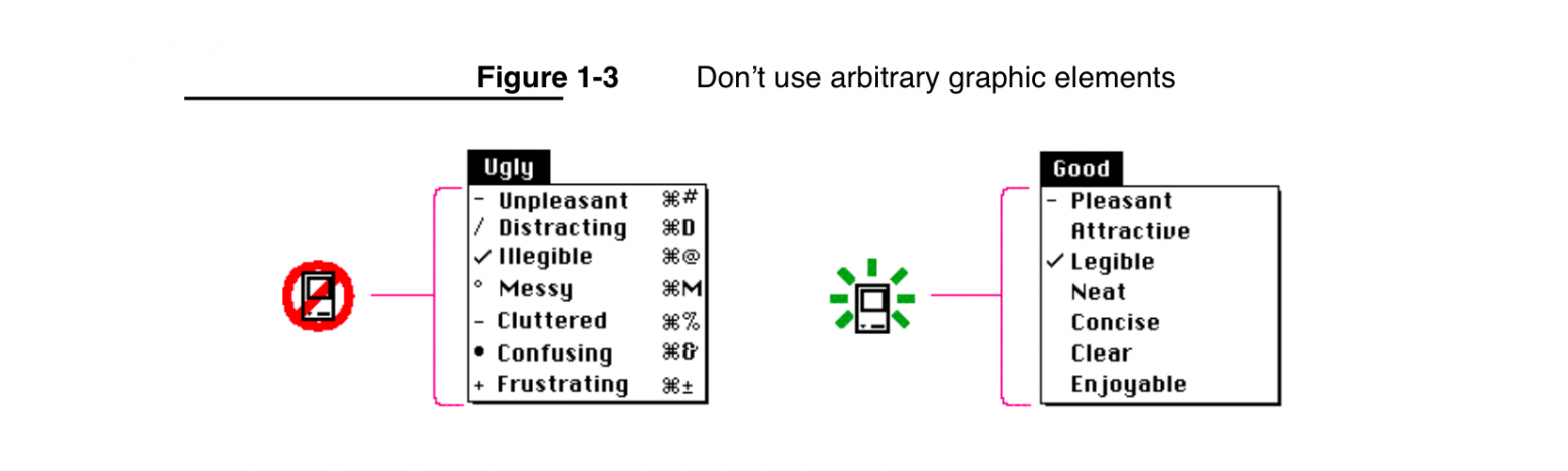
Apple has taken on an impossible task — creating unique, recognizable icons for every single menu item across the entire operating system. The principles from the 1992 Macintosh Human Interface Guidelines remain relevant today because they are based on human psychology, not on technology. Those guidelines warned against exactly this kind of icon overuse. The fundamentals of human visual perception haven't changed in 30 years, even if screen resolutions have.