What I Found Interesting on the Meteorologists' Mail Server
An exploration of the leaked meteorological mail server archive, where tree ring data spanning centuries reveals fascinating patterns about climate — and the limits of drawing conclusions from raw data.
Everyone has, of course, heard about the meteorological mail server archive that leaked onto the internet — there was even a discussion on Habr.
When I finally had a free evening, I decided to study the contents of this archive. I deliberately did not look for similar analyses so they wouldn't influence my reasoning (and I didn't find any anyway).
There's all sorts of stuff inside — PDFs, Fortran programs, Unix ELF executables, Russian names/surnames, and even Cyrillic comments inside some files. I've never been this curious in any computer game.
The first thing that caught my eye were directories like "yakutia," but I settled on the archive mbh98-osborn.zip. Inside it there's a directory called TREE, and within it — VAGANOV. Sounds friendly, right? That's what I decided to dig into.
Let me note right away that far-reaching conclusions and moral aspects of the issue are either relegated to the postscript or left outside the scope of this article entirely. The same goes for observations about the tone of the correspondence and its content in general. Various curious details I stumbled upon along the way are collected at the end of the article so they don't disrupt the narrative structure.
So, the archive mbh98-osborn.zip, directory VAGANOV. Besides some strange files like eof04.out (27 bytes), a couple of Fortran programs, and what was essentially junk, there was a directory with the telling name ORIG, containing something more meaningful inside.
File 1.txt.gz
It contains approximately the following:
Chronology 1 (SCH)
Years 0 1 2 3 4 5 6 7 8 9
1710 00  00 00 00  59 125 90 90 85 98
1720 76 140 87 79 133 152 103 143 142 122
1730 84 140 96 145 72 111 94 86 60 143
<...>
1980 81 113 133 122 100 75 84 111 95 113
1990 88 00   00  00  00 00 00 00  00  00
These are meteorologists — what's the first thing that comes to mind? Of course, temperature data. But it's unclear which kind: from 50 to 145 — in Fahrenheit or what? That would be strange for Vaganov. Each row clearly encodes data for a decade. There are files like these numbered from 1 to 61, all ending with a row for 1990. This can't be anything other than a year, especially since it literally says "Chronology" in Russian.
What seemed strange was that the data goes back to 1700 — that's a bit early for annual temperature observations, let alone in 61 cities. Also unclear were the codes — they don't really look like Russian city names: SCH, KHA, KHD, JAH, and so on. But there is a file called sib.dat, which provides the following for each file and its corresponding code:
1,SCH,69.17,66.49
2,KHA,69.5,67.12
3,KHD,69.54,67.07
4,JAH,70.58,67.25
…
So what are 69.17 and 66.49? They look like latitude and longitude. The locations are quite scenic.
I don't exactly remember how, but from some accompanying files in neighboring directories, I found mentions of trees, rings, and the phrase "Dendroclimatic reconstruction." So apparently this data represents measurements of annual tree rings, which can serve as a kind of proxy for past temperature estimates. This actually explains a lot — for example, why some files contain data going back to the 15th century.
I decided to set aside my conclusions on this matter because I'd long had the idea of laying this data out on a plane and looking at its dynamics — after all, the most interesting thing there is, is statistics. My first attempts were in Excel, and it was immediately clear there would be something worth looking at. So I decided to load all this data into a database and build all sorts of charts. Comrade Vaganov or his colleagues had simplified the task, by the way — they specifically prepared data for loading in files like vag01.dat, where data is given as year-value pairs, so I didn't need to bother parsing those matrices. Total records loaded: 26,031.
Charts
The first chart is simply the raw data from the first file (the link leads to the image itself).
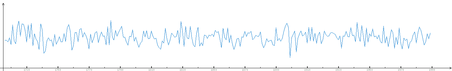
It looks rather noisy, especially when trying to display data from multiple files, so from here on I show averaged values.
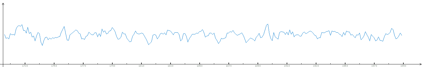
Next, I narrowed the time period to just the last century — it looks no less revealing. Two charts side by side:
The vertical offset between them is artificial — just so there aren't tons of intersections; the order of values is exactly the same. The second tree, by the way, was taken not far from the first (69.5, 67.12). The fact that the charts look similar is obvious, and from 1960 onward they practically coincide. This means that the distances between rings on different trees (separated by hundreds of kilometers) are very similar and depend on certain external conditions. Simplifying — on climate; simplifying further — on temperature.
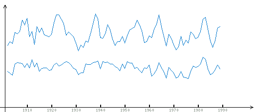
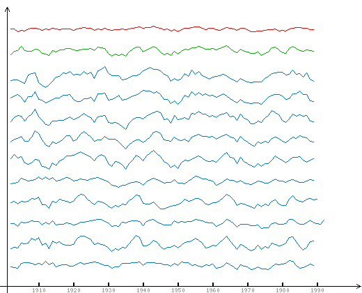
Let's build a chart for a dozen trees, all roughly in this area:
Our tree is the bottom one, going upward from there. If you look in sib.dat, the trees were collected at roughly the same latitude, with a sequential progression eastward from 69.17 (bottom chart) to 93.5 (top chart). Of course, there are various deviations, but an obvious correlation between the charts is also present. The second and fourth are so similar that I wondered if it was an error. The top five charts are remarkably similar to each other, especially when you remember what kind of data this is.
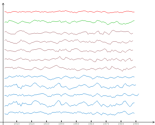
Then I complemented the picture with two more charts: the red one is the average across the entire sample, and the green one is the average across the displayed ten charts.
As expected:
a) the averaged charts are smoother;
b) the region-wide average is the most gradual and doesn't always reflect fluctuations in individual charts or even in the latitude-based average.
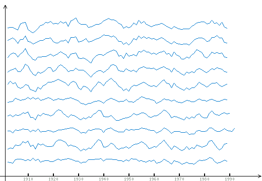
While already writing this report, I had the idea to take half the sample from a different part of the region, which I did:
Here the first five trees (the lower ones) are the same as in the previous figures — this is longitude 69.17–71.4. The other five are from the eastern edge of the country: 130.5–160.46.
Point one: it's noticeable that the first five charts are similar to each other, as are the second five. But there are practically no obvious correlations between charts of the first and second groups.
Point two: The average built from this set of ten charts is, first of all, much more gradual, and second, clearly bears the features of the overall sample average.
A Hundred and One Details
- In most files in the archive, the line ending is 0x0a — meaning some kind of Unix systems;
- In the file describing collection sites (sib.dat), the data is given in God-knows-what order, though ultimately all points are covered;
- I swapped latitude and longitude — otherwise you'd end up in Africa or the ocean, and besides, latitudes above 90° don't exist;
- Several files have overlapping date values — I stumbled on this during loading;
- Data file #55 is completely missing, even though it's mentioned in sib.dat and points here;
- The earliest record dates to 1325 — two hundred years before Ivan the Terrible;
- It looks very much like similar data is available for Canada as well;
- I was essentially fiddling with the first thing that fell into my hands — there's 60 MB of data in the archive total;
- The archive contains a PDF displaying an estimate of temperature changes over the last several centuries (one of the diagrams).
Sort-of Conclusions
You can go back and look at the first and second figures: there's no obvious tendency toward growth or decline visible to the naked eye. But what's perfectly clear is that the spread of values within a hundred years can be so extreme that even an obvious trend in one direction over the next 10–20 years means absolutely nothing — growth is always followed by decline, and decline by growth. Furthermore, if you look at the chart for five trees over 300 years (image), you can find the devil in a mortar there. For example, if you want, you can discern 10–20 year or even larger 50-year cycles, evidence of changing temperature dynamics in the last century, anomalies in the year of the Tunguska meteorite impact, and traces of Martian presence.
However, while working with this data, I learned that as a tree ages, the relationship between ring width and temperature changes. In which direction and how — I haven't figured out yet. To remove this change, there exists a procedure called Regional Curve Standardization, about which you can find some information on the internet. For this reason alone, it's absolutely clear that no significant conclusions about temperatures and climate can be drawn from this data. Also, for example, one must understand that ring size doesn't represent average annual temperature — it reflects even the average summer temperature in some nonlinear way.
The main thing I personally took away from this story: when you have access to an archive with such data, you should be studying the data itself — not the correspondence, and certainly not forum discussions of that correspondence — because that's far more interesting. Even 10–15 years ago, nobody could have had such an opportunity, and today I can casually, just like that, look at data from the year 1400 on a free evening. It's impossible to even imagine how those data had to be extracted from those locations (which, by the way, is mentioned in the correspondence). And that's today — who knows what someone will dig up tomorrow.


