Where Did Apple's Legendary Attention to Detail Go?
A scathing critique of Apple's declining UX quality, documenting dozens of interface inconsistencies, accessibility failures, and broken features in iOS 26 and macOS, particularly the problematic 'liquid glass' design language.
For me, Apple always represented meticulous attention to detail. But in the last 8–10 years, the company's solutions show no such orientation. The situation has become particularly bad in 2025, with iOS 26 and macOS updates containing numerous UX failures, accessibility issues, and inadequate QA testing.
This is a translation of John Ozbay's blog post.
Reminders App (macOS)
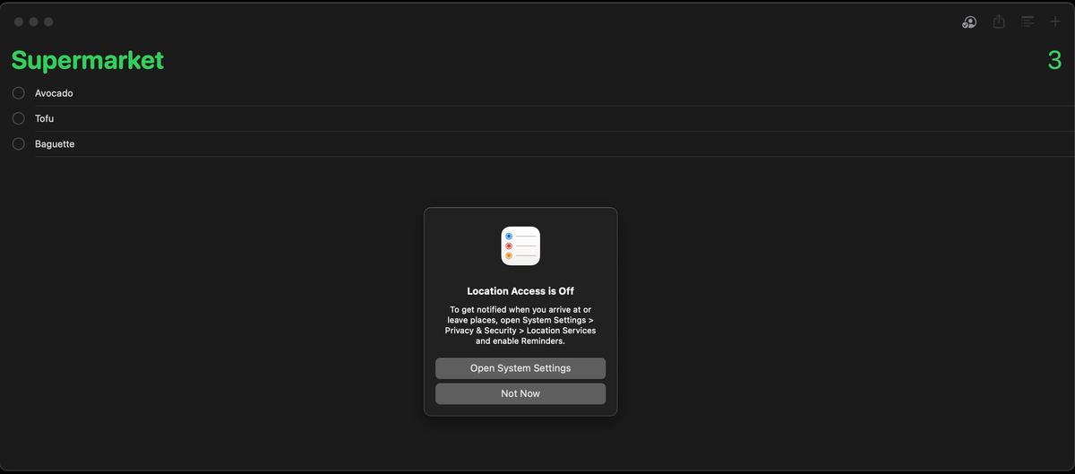
The Reminders application repeatedly requests location access permission despite the user denying it, interrupting workflow with persistent popups. There is no "Don't Ask Again" option — only "Open System Settings" or "Not Now." This is a fundamental UX failure: the system should respect the user's choice after the first denial.
Search Bar Inconsistency
Search functionality placement varies wildly across Apple's own applications:
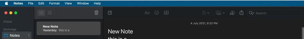
- Finder and Notes: upper right corner
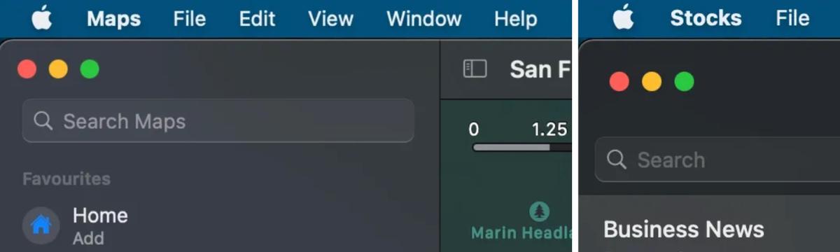
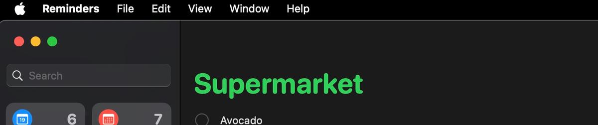
- Maps, Stocks, Reminders: upper left corner
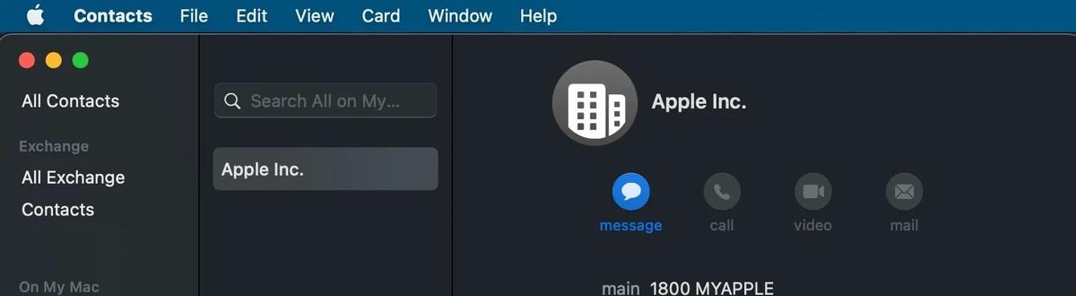
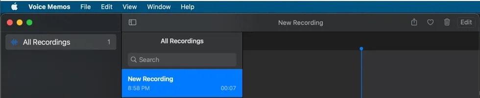
- Contacts, Voice Memos: center panel top
There is no consistent design language for something as fundamental as a search bar.
Tab Design Inconsistency
Different applications implement tabs in completely different ways:
- Dictionary, Keychain: separate row below header with reduced font
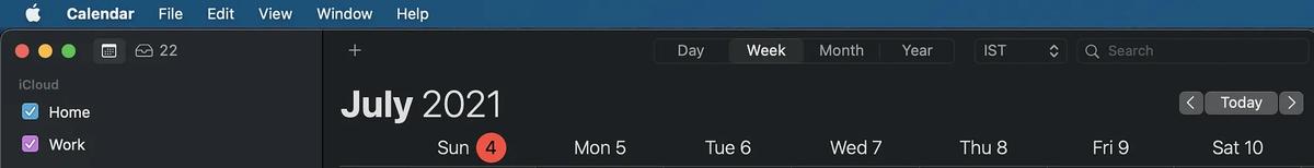
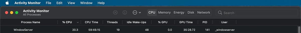
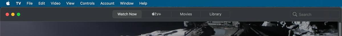
- Calendar, Activity Monitor, TV: integrated into header with varying designs
It feels like each app team works in complete isolation, with no shared design guidelines.
iOS 26 Problems
Files App
Text and folder names become completely invisible in dark mode, appearing as blank spaces. You literally cannot see what your files are called.
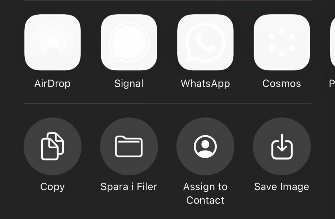
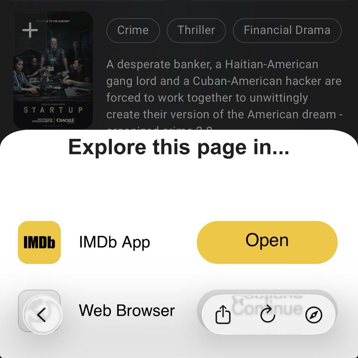
Share Menu
Application icons fail to render properly, appearing as transparent or missing elements. The share sheet — one of the most frequently used features — looks broken.
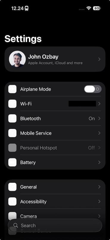
Settings
Icons don't display initially. Enabling reduced transparency "fixes" them, but breaks other UI elements — black bars appear inappropriately across the interface.
Reminders (iOS)
Large black bars obstruct the interface unpredictably, making the app nearly unusable at times.
iPad Folder Hover
The "liquid glass" visual effect persists indefinitely when hovering over folder groups on iPad, instead of fading naturally as intended. It just stays there, looking broken.
Browser Issues (iOS 26)
WebKit problems affect all third-party browsers, since Apple forces them to use its rendering engine:
- Auto-complete panels appear on every keystroke
- Bottom toolbar buttons flicker like "SOS signals"
- Viewport scrolling breaks layout — content slides under system UI
- Tab switching requires two taps with nauseating color flashing
- Fixed elements become inaccessible during scrolling


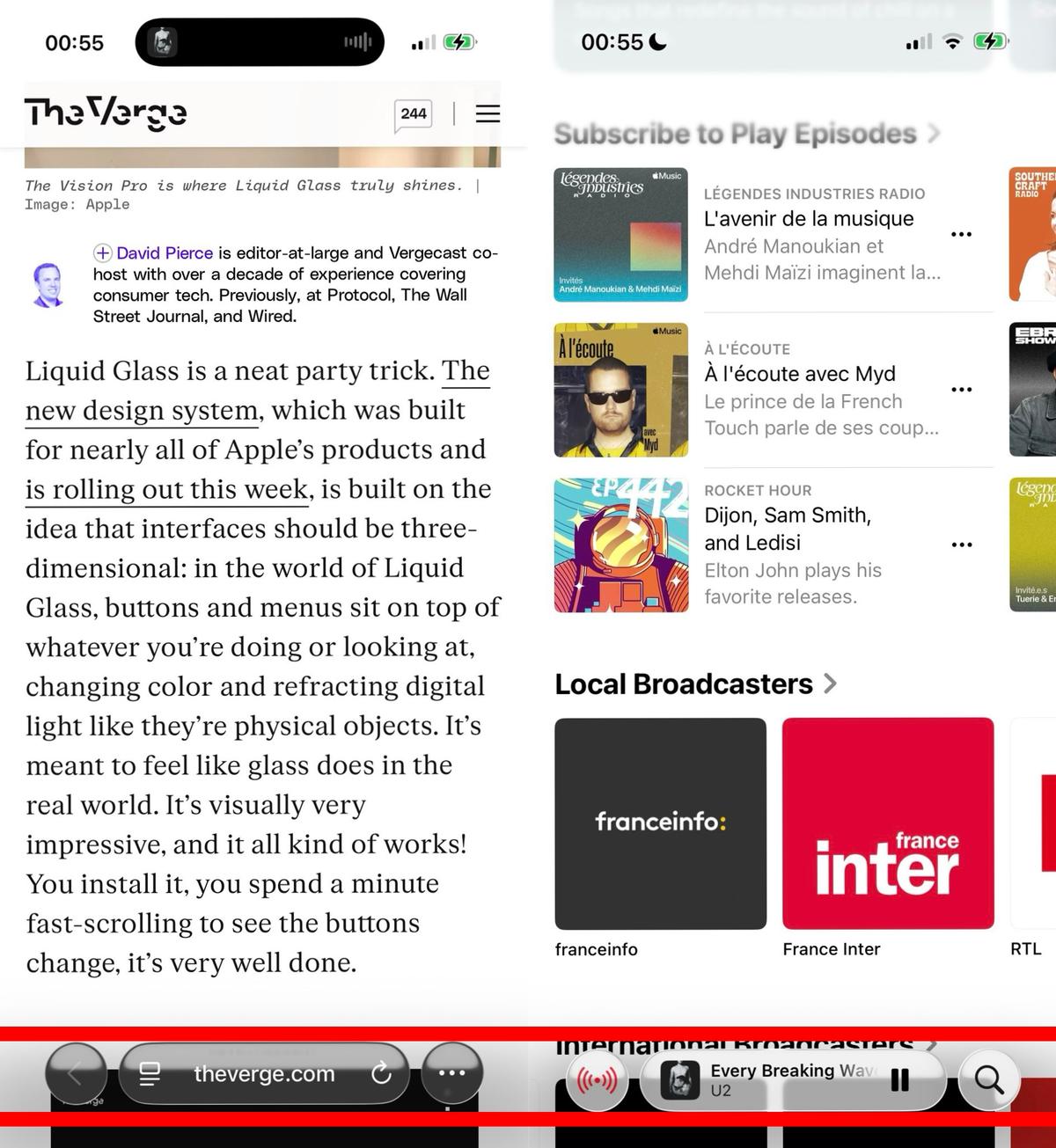
In-App Browsers
Scrollable content extends beneath the bottom UI, making fixed elements completely unreachable. This breaks countless web applications and websites.
UI Alignment Problems
Safari and other Apple applications show inconsistent UI alignment, suggesting that design teams either lack communication or don't follow shared guidelines.
iMessages Redesign
iOS 26 forces users to select message background images that obscure text readability and hide shared photos. The input field is difficult to locate. What was once a clean, functional messaging app now prioritizes decoration over communication.
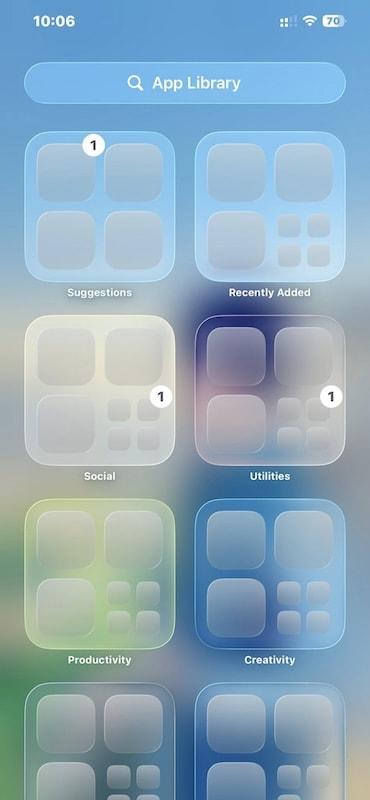
App Library
Application icons display unpredictably — appearing sometimes but not others, making navigation completely unreliable.

Additional Problems
- Notifications are nearly unreadable with light backgrounds
- Control Center has become a "glittery disco ball"
- iPhone 12 mini and 13 mini users experience accelerated battery drain
- Accessibility features have degraded significantly
- Mail app displays text overlapping other text
- The liquid glass design performs poorly on smaller screens

Conclusion
It feels like a project manager prioritized quarterly goals, created attractive mockups, and convinced leadership without adequate testing or stakeholder review. The "liquid glass" design language — which I'd compare to warning coloration on a black widow spider — now signals users to approach Apple products with caution.
This post is not exhaustive. There are at least a hundred other problems I haven't documented here.
I have tremendous respect for Apple employees. The problem is with leadership decisions that have transformed the design language from "meticulous attention to detail" into something that is visually appealing but functionally broken — interfaces that prioritize aesthetics over usability.

FAQ
What is this article about in one sentence?
This article explains the core idea in practical terms and focuses on what you can apply in real work.
Who is this article for?
It is written for engineers, technical leaders, and curious readers who want a clear, implementation-focused explanation.
What should I read next?
Use the related articles below to continue with closely connected topics and concrete examples.